YouTube Thumbnail Design Guide for Indian Creators: What Gets Clicks in 2026
Master YouTube thumbnail design with proven strategies for Indian creators. Learn the 4 CTR elements, curiosity gap technique, color psychology, and A/B testing in YouTube Studio.
Utkarsh Agrawal
6/7/20269 min read
Your thumbnail is a 5-second audition in a sea of thousands. When a viewer scrolls through YouTube, they see your title for maybe 1.2 seconds. Your thumbnail - that tiny 390×219 pixel frame on desktop, even smaller on mobile - is what stops them cold. A great thumbnail turns scrollers into clickers. A mediocre one sends them past without a second glance.
The algorithm is listening. When your CTR climbs, YouTube pushes your video to more people. When it tanks, they don't. Your thumbnail isn't vanity - it's the first lever that influences whether YouTube decides your video is worth promoting. For Indian creators especially, where competition is fierce and viewers' feeds are flooded, the thumbnail is often the difference between 100 views and 10,000.
This guide walks you through exactly how to design thumbnails that work - the psychology behind them, the technical setup, the mistakes most creators make, and the free tools you can start using today.
Why your thumbnail matters more than your video (CTR's role in the algorithm)
Let's be direct: YouTube's algorithm cares about click-through rate. It's one of the primary signals that tells YouTube whether your video is worth showing.
When you upload a video, YouTube tests it with a small slice of your audience. It measures how many people click on it when they see it. That's your CTR - clicks divided by impressions. If that number is high, YouTube gets confident that people actually want to watch your stuff, and it expands the test, pushing your video to bigger and bigger audiences. If it's low, YouTube interprets that as "viewers don't think this is worth their time" and pulls back.
Here's where most creators mess up: they focus on retention (keeping people watching) and miss CTR entirely. A video can have 90% average view duration but still tank because hardly anyone clicked it in the first place. YouTube can't measure retention if nobody clicks. The funnel starts with the thumbnail.
CTR benchmarks:
Below 2% - your thumbnail is actively hurting you. Redesign.
4-10% - good territory. You're competitive.
Above 10% - excellent. You've cracked something.
The catch: high CTR with low retention is worse than no CTR at all. A misleading thumbnail that gets clicks but makes viewers leave after 15 seconds signals to YouTube that you're clickbaiting. The algorithm penalizes this hard. Your CTR and retention work together. The thumbnail's job is to promise something the video actually delivers.
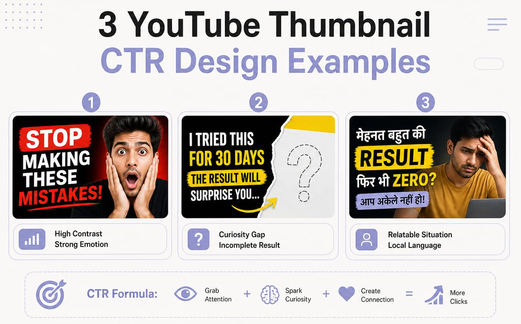
The anatomy of a high-CTR thumbnail (the 4 elements)
High-performing thumbnails aren't random. They follow a consistent structure. Build around these four elements:
1. A strong focal point (usually a face or key object)
Your eye should land on one thing immediately. For most niches, that's a human face - ideally with a strong emotion. When you're scrolling fast, a face with clear emotion (surprise, excitement, confusion, satisfaction) registers instantly. Your brain processes faces faster than text or abstract shapes.
Position this focal point using the rule of thirds: imagine your thumbnail divided into nine equal squares (three by three grid). Place your key element at one of the four intersection points, not dead center. This creates visual tension and pulls the eye in naturally.
2. High contrast between text and background
Text needs to read at thumbnail size - which is 390×219 pixels on desktop and 120×67 on mobile. At mobile size, most fonts disappear. Your text needs to be thick, bold, and high-contrast against the background.
If your background is bright, use dark text or a dark outline. If it's dark, use bright text. Never use similar tones (dark gray on black, light yellow on white). The contrast should feel almost aggressive - if you squint, the text should still be readable.
3. A curiosity gap
This is the secret weapon most creators sleep on. A curiosity gap is the feeling that something is incomplete or unexpected - something that makes your brain want to know more.
Examples:
Show a shocked face but crop out what caused the shock
Display a number or percentage but hide what it's measuring
Frame an incomplete situation: "this YouTuber's subscriber count" but show a confused face
Create visual tension: one element that doesn't belong (a green arrow pointing at an odd detail, a red circle highlighting something unexpected)
The curiosity gap doesn't spoil your video's twist - it teases it. Viewers click because they need to know what happens next. This is why "I found a secret trick" thumbnails work even on their hundredth variation. The thumbnail hints, the video delivers.
4. Brand consistency
This is where most creators leak views. After you've built a few strong thumbnails, stick with elements that work: the same fonts, the same color palette, the same positioning style, the same emoji or icon. When a viewer is skimming and sees your thumbnail, they recognize it instantly as you, not as some random video.
Consistency builds brand recognition. Over time, your thumbnails become recognizable even when the viewer doesn't read the title. That's power.
The curiosity gap: how to make viewers NEED to click
The curiosity gap is simple but potent. It works because human brains hate incomplete information. When something doesn't add up, your brain demands resolution.
Here's how to build it:
Show the result, hide the cause. If your video is "I tried this technique for 7 days," your thumbnail shows the dramatic result (transformed face, shocked expression, before/after comparison) but never says "7 days." The viewer wonders: what happened? What technique? What's this person's reaction about?
Create visual mystery. Point an arrow at something odd. Highlight a detail that doesn't make sense in isolation. Use a face that clearly reacts to something off-camera. The viewer's brain fills in the gap and clicks to understand.
Contrast two things. "Rich vs poor," "before vs after," "normal vs broken" - visual contrast creates immediate questions. Your brain asks which one applies to the video.
Avoid: over-explaining in the thumbnail. If your text reads "I made $10,000 in 24 hours by doing this," you've closed the gap. The viewer already knows the answer. They might click out of interest, but the urgency is gone. Better: show the money or a shocked face, let the title ask the question, and make the thumbnail hint at the answer without confirming it.
The best curiosity gaps feel inevitable after you click. The thumbnail teases, the video satisfies. It's not manipulation - it's honest intrigue.
What works for Indian audiences (with examples by niche)
Indian creators operate in a unique ecosystem. Viewers scroll fast. Competition is high. Preferences run distinct from Western creator communities.
Bright, saturated colors outperform muted tones. Orange, yellow, bright red, electric blue - these colors stop scrolls. Pastels and washed-out hues blend into the background. If your niche allows it, lean vibrant.
Text in Hindi or Hinglish converts better than English-only. A thumbnail with bold Hindi text or a Hindi + English mix signals "this is for me" to Indian viewers faster than English alone. If your audience is Hindi-speaking, use it. Fonts like Roboto Bold or Poppins Extra Bold render crisply even at small sizes.
Emotional faces dominate. Indian audiences respond strongly to expressions - not just surprise, but also confusion, joy, frustration, satisfaction. A face with a clear, unambiguous emotion performs better than a neutral expression. Film-style acting reads well here: exaggerate slightly.
Relatable situations beat abstract concepts. A thumbnail showing someone eating food, using a gadget, or reacting to a real scenario outperforms abstract icons or metaphors. Specificity wins.
Red and yellow text pops strongest. These colors create urgency and joy, both high-engagement emotions. Use them for key words or numbers.
Quick wins by niche:
Finance/investing: Shocked face + green/red numbers = trust + urgency
Cooking: Food close-up + satisfied face = appetite + anticipation
Tech reviews: Product + exaggerated reaction = curiosity + credibility
Comedy/entertainment: Extreme emotion + unexpected visual element = fun
Education: Problem + solution visual = clarity + value
Text on thumbnails: less is more (and how to do it right)
This is where amateurs stumble. They cram 15 words onto a thumbnail and wonder why nobody clicks.
Rule: maximum 5-6 words. That's it. If it takes more to describe your video, your thumbnail is doing a poor job. The text's job is to punctuate, not to summarize.
The text should complement the title, not repeat it. If your title is "I tried eating only rice for 30 days - here's what happened," your thumbnail should not say "30 days" or "rice challenge." Instead, show the result or reaction. Your title asks the question; your thumbnail hints at the answer.
Strong text examples:
"INSANE" + shocked face
"THIS WORKS?!" + test result
"₹10 लाख में" + product or result
"FAILED" + funny expression
"YOU DIDN'T KNOW?" + surprising image
How to execute:
Pick one phrase (2-4 words max) that adds information your title doesn't
Use a thick, bold font (Roboto Bold, Poppins Bold, Montserrat Bold)
Size it large enough that 80% of the text fits in the upper or lower third - never centered vertically
Add a dark outline or slight drop shadow so it reads on any background
Check readability at mobile size (imagine the thumbnail at 120×67 pixels)
Avoid thin fonts, script fonts, or decorative fonts. They're impossible to read at thumbnail size. Stick to sans-serif workhorses: Roboto, Poppins, Montserrat, Open Sans.
Color strategy for maximum impact
Color psychology works on YouTube. Different colors trigger different emotional and behavioral responses, and Indian audiences have distinct color preferences shaped by culture and environment.
Orange and yellow - energy, enthusiasm, warmth. Great for growth content, lifestyle, wellness, and entertainment. These colors scream "exciting" and perform well on Indian feeds.
Red - urgency, excitement, danger. Perfect for "limited time," shocking revelations, bold claims. Use sparingly; too much red feels aggressive. But a red accent on a yellow background? Irresistible.
Blue - trust, calm, professionalism. Tech, finance, and serious content. Performs well for Indian audiences seeking credibility, especially in investment or educational niches.
Green - money, growth, positive change. Finance and investing content. Also works for gaming (matrix-style green) and health.
Purple - creativity, mystery, premium. Lifestyle and artistic niches.
Pink/Magenta - playfulness, youth, energy. Entertainment and fashion.
Pro strategy: pick two colors and stick with them. One dominant background color + one accent for text or highlights. Consistency across 20 videos creates instant recognition. Your audience begins to associate your color combo with your channel.
Avoid: muddy, low-saturation colors; too many colors competing (3+ colors usually means chaos); colors that blend together (light gray + white, navy + black).
A/B testing your thumbnails (using YouTube Studio)
You can guess what works, or you can test it. YouTube Studio now has a built-in A/B testing tool called Test & Compare - use it.
How to set it up:
Go to YouTube Studio → Videos
Select a published video
Click "Details" → "Thumbnail"
You'll see an option to "Test & Compare"
Upload a variation (different text, color, expression, crop)
YouTube runs both thumbnails and shows which one performs better over 3-7 days
When to test:After every 5-10 videos. Test one variable at a time: either text vs no text, or color A vs color B, or face vs product. If you test everything at once, you won't know what actually works.
What to test:
Bright vs dark backgrounds
Text vs no text
Different emotions on the same face
Position of the focal point (rule of thirds variations)
With/without color overlays
Reading the results:YouTube shows you which thumbnail got more clicks and how much more. If the winning thumbnail beats the loser by 5%+, that's statistically meaningful for most channels. Use that data to refine your next batch.
Don't obsess over single-video tests - aggregate patterns across videos. If blue backgrounds beat orange in three tests, odds are blue is stronger for your niche.
Tools and workflow (free options for Indian creators)
You don't need expensive software. Canva is genuinely the right tool for most creators - it's fast, templates exist, and it's free.
Best free tools:
Canva - Start here. Templates specifically for YouTube thumbnails, built-in design elements, no learning curve. Upload your face, add text, pick colors. Done in 5 minutes. Free tier is plenty.
Adobe Express (formerly Adobe Spark) - Step up from Canva if you want more control. Built-in stock photos, smoother typography tools. Free tier includes basic features.
Photoshop (if you already have it) - Overkill for most creators, but if you're comfortable with it, precise control over every pixel.
Pixlr - Free alternative to Photoshop. Lighter, easier to learn, browser-based.
Stock photos (free):
Unsplash - high-quality, zero licensing issues
Pexels - same; both are genuinely free
Adobe Stock - paid, but high quality if budget allows
Workflow:
Decide on your text, focal point, and color scheme
Open Canva, search "YouTube thumbnail"
Start with a template or blank 1280×720 canvas
Drop in your image (face or object)
Add text (thick, bold, high-contrast)
Add one accent element (arrow, highlight, emoji) if needed
Export as PNG or JPG (under 2MB)
Upload to YouTube
The whole process: 5-10 minutes per thumbnail once you develop a style.
Frequently Asked Questions
What's a good CTR for YouTube videos?
A CTR between 4-10% is solid. Below 2% suggests your thumbnail isn't compelling enough and needs redesign. Above 10% means you've nailed it. Remember: high CTR only matters if retention is strong - misleading thumbnails tank your watch time and hurt the algorithm.
Can I use faces with emotions on every thumbnail?
Faces work, but not as the only tactic. Mix them with other elements - curiosity gaps, text, bold colors, relatable situations. Overusing the same expression loses impact fast. Rotate between surprise, excitement, confusion, and satisfaction to keep viewers interested.
How many words should be on a thumbnail?
Max 5-6 words, and make them count. Your thumbnail should complement your title, not repeat it. If the title says 'I tried X for 30 days,' show the result or reaction, not the phrase itself. Keep text to less than 30% of the thumbnail area.
What colors work best for Indian audiences?
Orange and yellow signal energy and enthusiasm. Red creates urgency. Blue builds trust, especially for tech and finance content. Avoid dark, muted tones - bright, saturated colors perform better in India. Test what your niche responds to, then stay consistent.
How often should I A/B test thumbnails?
After every 5-10 videos, run a test in YouTube Studio's Test & Compare feature. Compare your latest thumbnail against a variation on 3-5 key videos to see which performs better. Use the data to refine your template for the next batch.
Try ytverse.in
Building a YouTube channel that actually grows requires more than great thumbnails - it takes strategy, consistency, and someone who understands how creators in India actually build audiences. ytverse.in is built for Indian creators who want to skip the trial-and-error and grow faster.
Whether you're stuck at 1,000 subscribers or pushing toward 100K, ytverse teaches the systems that work: how the YouTube algorithm actually works in 2026, YouTube SEO strategies that Indian creators use, and how to actually grow your channel. Thumbnails are one piece - but combined with the right title strategy, upload schedule, and content positioning, they're the piece that unlocks exponential growth.